Pages

Showing posts with label Stock Selection. Show all posts

Tuesday, November 9, 2010

Stock Selection - Baseline Returns by Holding Period

In order to fully evaluate a trading strategy, I need to develop a baseline with which I can compare it to and ensure the returns exceed the market returns.  The baseline performance is calculated for the period over which I will be backtesting my strategy results (backtest period).  The baseline period will begin on September 15, 1998 and end on September 15, 2009.  I will be using StockFinder 5.0 to perform the calculations.  I used all US common stocks for my research sample.

I wanted to incorporate some basic liquidity conditions into my tests to remove the sporadic behavior of illiquid and low priced stocks.  Each stock considered in the analysis met the following conditions:
  • Closing price was greater than $1 (C > 1)
  • Daily volume was greater than 100,000 shares (V > 1000)

I created a combination condition using the two criteria above.  I then averaged the return of all the stocks that passed the combination condition over several time periods: 1 day, 5 days, 10 days, 15 days, and 20 days.  I performed these calculations for each day during the backtest period generating a sample of 2768 returns for each time period.  Below is a chart listing the summary statistics for each return period sample:


Across the top of the chart are the length of time for each return (ex. average return of a stock over 20 days).  The upper section of the chart shows the percentile calculation for each sample.  The distributions are very similar for all return periods.  As expected, magnitude of the return increases with the length of the period.

The middle section shows the average of the samples falling in between the percentile limits (ex. average of all stocks between the 25th and 75th percentiles).  The averages help determine the robustness of the returns.  If all of the averages are similar, the returns are robust and not limited to a small portion of the sample.  Each sample is fairly consistent over each percentile range.

The bottom portion of the chart shows the win/loss characteristics of each sample.  The winning percentage increases the longer the stock is held.

Below is a graph that shows the average and median return for each period over the entire sample.  For example, the average return for a stock (meeting the liquidity criteria) over 20 days is 0.87%, and the median is 1.11%.


This graph can be used to help determine the period of time to hold a trade in order to overcome the effects of slippage and commissions.  You would need to trade with a significant amount of equity (without using leverage) to make a strategy profitable when holding a trade for only 1 day because the average return is only 0.07% (median is 0.11%).  Slippage and commission fees are much easier to overcome when a stock is held for 20 days because the average return is 0.87% (median is 1.11%), which means you would need much less equity to achieve the edge.  When developing a trading strategy, the returns can be compared to the values in the graph to determine if there is really trading edge or if you are just capturing the movement of the market.

Conclusions of the baseline analysis:
  • Winning percentage increases as the length of the trade increases.
  • Average and median return increases as the length of the trade increases.
  • Less equity is required per trade to overcome slippage and commissions as the trade length increases.

Tuesday, October 26, 2010

Stock Selection - Strategy Development

I will be researching and developing a trading strategy over the coming months.  All of my test results and progress will be documented on this blog.  I will be sharing basic code and discussing various ideas to improve returns, while hopefully avoiding over-optimization.  Once this process is completed, I am expecting to have a structure for developing and evaluating trading strategies which I can use to research many other market anomalies.

First, I need to determine a period of time which to perform back tests and research trading ideas.  I have already posted my choice here.  The time frame will begin on September 15, 1998 and end on September 15, 2009 and include all US equities.  I will be using StockFinder 5.0 to back test trading ideas over this time period.

Second, I need to focus on a strategy that will fit my style of trading.  I am comfortable holding trades anywhere from 1 day to about a month, so this will not be a day trading strategy since I do not have the resources (time, equity) to successfully trade it.  I wouldn't mind placing 1-5 trades a day, but more than 5 trades would create a cumbersome portfolio over the span of a few weeks that would be difficult to maintain with my other commitments.

Third,  I need a strategy that produces reasonable returns that would likely overcome slippage and commissions.  Currently, I have no way of testing these ideas and including the effects of slippage and commissions.  I will try to develop a fixed percent reduction in the average trade results to account for such effects, but the returns should be significant enough for the average trade to overcome slippage and commissions.

Fourth, I want to adopt Michael Stokes' (MarketSci) philosophy of limiting the word count on his results posts.  This should help me avoid lengthy descriptions and unwanted analysis, while keeping the results posts clear and concise.

Any advice or comments are welcomed during the process, but keep in mind that I am a beginner.  At the very least, this should be a great learning experience that will help me improve me skill set.

Monday, October 25, 2010

Stock Selection - StockFinder 5.0 Limitations

After working with StockFinder 5.0, I have discovered that the back test results can be slightly misleading if you aren't aware of what the software is reporting.  Here is an example of the results reported by StockFinder once a back test is completed:


StockFinder reports some very common metrics for system analysis.  It is important to note that the the number of winning trades (5558) plus the number of losing trades (4320) equals 9878 trades, which is not equal to the total number of trades (9939) reported.  This happens because some trades will return 0.00%.  StockFinder does not count the 0%-return trades as winners or losers.  So the 0%-return trades do not contribute to the # Trades, Return/Trade, or Time/Trade calculations for the Winners and Losers categories.  The Winning % (56%) is calculated by taking the number of winning trades (5558), which excludes the 0%-return trades, and dividing by the number of total trades (9939) which includes the number of 0%-return trades.  The Gain\Loss Ratio (1.8) is calculated by taking the Winning Return/Trade (8.25%) and dividing it by the Losing Return/Trade (-4.52%).

It is important to acknowledge these facts because they can have a significant effect on further analyses.  For example, if you are performing a Monte Carlo analysis you will often require winning percentage, average win, and average loss as inputs into the analysis.  If you use the metrics directly from StockFinder, your analysis will not yield the correct expectancy that would match the average return for all trades (2.65%).

I will be adding a Monte Carlo analysis statistics section to all reported back test results that will account for the issues listed above.  I have chosen to add the performance of the 0%-return trades into the winning trades category.  This will increase the number of winning trades, increase the winning percentage, and decrease the average return per winning trade.  The addendum to the results chart will provide an easy reference for the three Monte Carlo analysis inputs:  Win %, Avg Win, Avg Loss.  Below are the updated back test results:


This format will preserve the results from StockFinder, while making it easy to evaluate system performance using a Monte Carlo analysis.

Monday, October 11, 2010

Stock Selection - Target Stock Group Returns

Many of the blogs I follow indicate that in order to be a successful trader, you have to clearly identify your target trading vehicles.  In this post I will be reviewing the performance of different groups of stocks broken down by percent return over several time periods.  This will help me identify target stocks groups to study and trade.

In this study I will be using all US Stocks and studying over a period from September 15, 1998 to September 15, 2009.  This time period captures the behavior of multiple bull and bear markets, as well as showing very little return on the SP500 for a buy and hold investor.

Since I have a day job that does not permit me to trade actively during the day, I would have to enter my orders in the morning and review my positions in the evenings.  I would rely on stops to limit my risk during the day. Thus my shortest holding period for a position is about a day.  Long holding periods over a month don't sit well with me, so I am limiting my holding periods to 4 weeks.  I split the returns for stocks into 5 days, 10 days, 15 days, and 20 days.  I counted the number of stocks exceeding a return threshold for each period of time.  This analysis only looks at return on price and does not limit the stocks by any other criteria such as volume, float, etc.

I created an indicator that counts the number of US stocks that are up greater than a specified percentage from X days ago.  This was a rolling indicator for the time frame.  For example, the indicator could say that there are 20 stocks up greater than 30% in 15 days on Day 1, then on Day 2 it could also say 20.  The 20 stocks on Day 2 may be the same stocks as Day1, or there could be a few that are different.  I am not interested on whether or not the stocks are different from day to day.  I am only concerned with how many stocks have exceeded the return for the start date for the time period.

I summarized the data using several statistics.  The statistical summaries are shown in the chart below:


I began analyzing the data by looking at the average and median number of stocks for each period.


The bars represent the average number of stocks (over the entire 11 years) that exceed the return threshold each day.  The data table is included below the chart for each bar value.  In order to interpret the chart, take the first value in the data table, 710 (upper left), as an example.  There are 710 stocks on average each day that have returned greater than 5% in the past 5days.   Look at the last value in the data table, 55 (lower right), as another example.  On the average day, there are 55 stocks that are up greater than 50% in the past 20 days.  The chart shows the average number of stocks exceeding the return threshold decreases as the threshold increases, no big surprise.


The bars represent the median number of stocks (over the entire 11 years) that exceed the return threshold each day.  Using the first value in the data table, 50% of the days during the 11 years had at least 591 stocks that had a return greater than 5% in the past 5 days.  The median values are considerably lower than the average values due to the distribution in the results.  The results are heavily skewed, as indicated by the chart below:


The average will be larger than the median because the distribution is skewed to the right, yielding a long tail.  For this analysis, the median is a better metric for the number of stocks compared to the average.  The median will indicate the number of stocks that exceeded the return on 50% of the 11 year test period.  To get a feel for the extremes of the period, I plotted the maximum number of stocks to exceed the return in the chart below:


There is a significant difference between the max values and the average/median values.  For example, on one day during the 11 year look back period, 4301 stocks exceeded a 5% return in 5 days.  This is over half of the US stock market (about 7000 stocks) and 4301 is over 7 standard deviations above the mean.  I would not use a normal distribution to model these results.  Whats more incredible is that on November 28, 2008, there were 419 stocks exceeding a 50% return in 5 days!

I calculated the percent of days during the 11 year look back period that exceeded each return threshold.  This will help to define the distribution of results better than a single number like the average or the median.  Below is the chart for the stocks exceeding returns in 5 days:


The bars indicate the number of stocks that exceeded the return threshold in 5 days.  I calculated the number of stocks that exceeded the return threshold for 90%, 75%, 50% (median), 25%, and 10% of the days during the 11 year look back period.  I also included the maximum and average number for stocks exceeding the return threshold for the entire look back period.  Using the first column of the data table, 90% of the days  had at least 276 stocks that exceeded a 5% return in 5 days, 75% of the days had at least 390 stocks exceeding a 5% return in 5 days, 50% (which is also the median) of the days had at least 591 stocks, 25% of the days had at least 869 stocks, and 10% of the days had 1224 stocks exceeding 5% in 5 days.  Below are the charts for 10, 15, and 20 days:


How are these numbers helpful?  They can be used to determine what to expect in terms of returns on any given day.  Let's say I was trying to pick a stock that I thought would increase in price by 50% in the next 5 days.  From the charts, I know that 90% of the time there is only going to be about 1 stock that will return >50% in the next 5 days.  Even on the best days (top 10%), there are only about 20 stocks that will return >50% in the next 5 days.  These charts provide a feel for what to expect from the market in the coming 4 weeks.

Future exercises will determine how to separate between most days (90%) and the best days (10%).  If I can develop a filter to identify the 10% of days that see the best chances of stock picking, I will certainly improve the odds of success.  I can also use these results to identify groups of stocks based on the opportunity how long I want to hold a trade, what return I can expect, and the number of stocks that would fit those criteria.  Finally, once a target group of stocks is selected, I can then study the characteristics of that group to help improve the chances of selecting the correct stocks.

Sunday, October 10, 2010

Stock Selection - Backtest Time Frame

Stocks selection is critical for trading success.  In order to explore various trading ideas, I will be using backtesting to evaluate whether the ideas have statistically significant edges.  It is important to choose a proper time frame that encompasses various market behaviors so that you can truly test the historical performance of a trading idea.

I am selecting my backtest time frame based on the following criteria:
  • Must contain at least one bull market
  • Must contain at least one bear market
  • Must cover at least 5 years
  • Must provide little to no return for a buy-and-hold investor based on the SP500 (SPY)
Based on my available data and the criteria above, I have selected the following time frame for backtesting:
  • Start:  September 15, 1998
  • Finish:  September 15, 2009
  • Total Number of Trading Days = 2870


This time frame spans 11 years (132 months) and contains multiple bull and bear markets.  This period also contains the more recent price behavior of the markets, which is probably more pertinent to the performance of the market over the coming years.  The closing price for SPY on September 15, 1998 was $104.06.  The closing price for SPY on September 15, 2009 was $105.72, a difference of $1.66 per share for a return of only 1.6%.
  • Total Number of Months = 132
  • Number of Months with Positive Return = 71
  • Number of Months with Negative Return = 61
  • Percent of Months with Positive Return = 53.78%
  • Percent of Months with Negative Return = 46.22%
  • Average Return for Positive Months = 3.45%
  • Average Return for Negative Months = -3.71%
  • Highest One Month Return = 9.93%
  • Lowest One Month Return = -16.52%


Tuesday, April 13, 2010

Stock Selection - Breakout - 1 Day Weakness Analysis

In further efforts to understand the factors that have effects on short term breakout returns, I have decided to look at the performance of the day before the breakout day to see if it has any effect.  Since mean reversion has been the dominant theme for the past decade, this post will see if a down day preceding the breakout day increases short term breakout returns.  I will define one day weakness by comparing the close one day before the breakout (C1) to the close two days before the breakout (C2).  Below are the baseline breakout results (no breakouts in the past two days) separated into percent groups:


I am using the Vanguard Total Market Index (VTI) component stocks as a proxy for the entire market, which contains 2401 stocks. The backtest analysis will span the time frame beginning on September 15, 1998 to September 15, 2009.

I began the weakness analysis by looking at the performance of breakouts when the close the day before the breakout was lower than the close two days before the breakout (the day before the breakout was a down day).  This was a preliminary analysis to determine if one day weakness could have an effect on the breakout performance.  The results of the analysis are shown below:


One day weakness appears to have limited potential when comparing the average return per trade to the baseline results.  The results show a marginal improvement (average difference between weakness and baseline results is 0.02%) for breakout levels between 1-6%. For breakout levels between 6-15%, the weakness results show an average difference of 0.12% on the average return per trade.  There is little difference between the baseline and the one day weakness results for breakout levels >15%.

Next, I separated the one weakness into separate levels to isolate the effect of each weakness level.  Below are the sample results for the 7-8% breakout group:


Using the results from each percent group, I compared the difference between the average return per trade for each weakness level and the average return per trade for the baseline results. I summarized the comparison in the following chart:


The values in the chart are the difference between the weakness level results and the baseline results for the same percent group. When the weakness return is greater than the baseline return the box is tinted green and when it is less than the baseline return the box is tinted red.  The tint is darker for values further away from 0%  The chart includes the results for each breakout percent group and each weakness level.  I included the average and median values for each grouping, as well as the baseline average return per trade for each percent group. The bold boxes highlight the maximum average return difference for each percent group.  Below is a chart summarizing the average and median return differences for each one day weakness level:


Most of the maximum returns occur at one day weakness levels C1<0.90*C2, which show an average difference in the average return per trade of 0.40%.  The only other weakness level that shows promise is the C1=(1.00-0.99)*C2 level, which has an average difference of 0.18%.  The average difference for all the results is 0.07%, and the median difference for all results is 0.02%.

The chart below summarizes the average and median return differences for each breakout percent level:


There is a dramatic difference between the average and median results which is due to the exceptional performance of the one day weakness level C1<0.90*C2 influencing the data.  In this case, the median is a better indicator of performance.  One day weakness seems to only impact the results for breakout levels between 7-15%.

The chart below shows the average return per trade for all breakout percent groups and one day weakness levels:


The values in the chart are colored green if the average return per trade is above 0% and red if the average return per trade is below 0%. The average and median values for each row (one day weakness level) are located in the two columns on the right side of the chart. The average and median values for each column (percent group) are located in the bottom rows. The baseline values (yellow) are located in the bottom row. The maximum average return per trade for each percent group is indicated by a thick border. All of the average returns greater than or equal to 0.22% (the max baseline return) are colored in blue font.
 
The average of all the returns is 0.16% and the median is 0.16%, which are greater than the baseline average of 0.09%. The average of all the maximum (thick border boxes) average returns is 0.55%. It is clear that breakouts greater than 15% still exhibit short term mean reversion behavior because the average return for that breakout level is -0.40%. Below is a chart comparing the average return per trade by breakout percent level with the baseline (three bottom rows from above chart):
 

The chart shows that most of the average returns are larger than the baseline returns, but median returns tell a different story.  The median returns for breakout levels between 1-7% are very similar to the baseline returns.  The median returns are larger than the baseline returns for breakout levels between 7-15%. One day weakness appears to have no effect on breakouts exceeding 15%.

Out of 88 tests for one day weakness, 32 had an average return per trade greater than 0.22%. Out of those 32 tests with returns greater than 0.22%, 6 occurred for weakness level C1=(1.00-0.99)*C2, 5 occurred for weakness level C1=(0.97-0.96)*C2, 10 occurred for weakness level C1<0.90*C2, and 20 occurred for percent groups between 6-10%. I ran a backtest for each breakout level and limited the results to one day weakness and breakout levels between 6-10%, which yielded an average return per trade of 0.29% compared to 0.20% for the same baseline breakout levels. 
I compared selected weakness results with the baseline results. Below is a chart summarizing the results of the backtest:


The chart above shows that the average return per trade exceeds 0.25% for one day weakness of C1< C2 and breakout percent levels between 6-10%, with a maximum average return of 0.31% for the 7-8% level.  The average return per trade exceeds 0.30% for one day weakness of C1=(1.00-0.99)*C2 and breakout percent levels between 6-9%, with a maximum average return of 0.47% for the 8-9% level.  The average return per trade exceeds 0.30% for one day weakness of C1<0.90*C2 and breakout percent levels between 1-15%, with a maximum average return of 0.71% for the 7-8% level.  This is substantially better than the baseline results which had a maximum average return per trade of 0.22%.

It does appear that one day weakness plays a small role in short term breakout returns, but the effect seems awfully specific and inconsistent.  Mean reversion still appears to play a big role with the returns for the lowest weakness level C1<0.90*C2, which showed very large average returns. The number of trades is low (<2000 per breakout level) and there may only be a small proportion of the results population accounting for the large returns.  I will not be including the one day weakness criteria in my breakout trading strategy.

ANALYSIS SUMMARY:
  • One day weakness criteria will not be included in the breakout trading strategy.
  • One day weakness improves returns on breakout levels between 7-15%.
  • The best returns occurred for a weakness level of C1<0.90*C2 which had an average return per trade of 0.49%.  The second best returns occurred for a weakness level of C1=(1.00-0.99)*C2 which had an average return per trade of  0.27%.
  • The average of all the maximum returns for each breakout level (thick border boxes) was 0.55%.

Thursday, April 8, 2010

Stock Selection - Breakout - Volume Increase Analysis

It is a common understanding that a significant move should be accompanied by significant volume, or else the move could be a false breakout.  In this post i will investigate the effects of volume on my breakout study.  Specifically, I am looking at the volume on the breakout day compared to the volume on the day before the breakout day.  Below are the baseline breakout results (no breakouts in the past two days) separated into percent groups:


Once again I am using the Vanguard Total Market Index (VTI) component stocks as a proxy for the entire market, which contains 2405 stocks.  The backtest analysis will span the time frame beginning on September 15, 1998 to September 15, 2009.
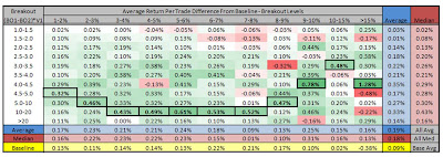
A began the volume analysis by looking at the performance of breakouts when the volume on the breakout day was greater than or equal to the volume on the day before (breakout day showed an increase in volume).  This was a preliminary analysis to determine if volume could potentially play a significant role.  The results of the analysis are shown below:


The volume hypothesis shows great promise.  The volume increase average return per trade was as good or better than the baseline results for all breakout groups, averaging an increase of 0.10%.  These results merited further investigation.

For the next analysis, I created several volume thresholds for each breakout percent group.  The volume on the breakout day was greater than a breakout factor (BO) multiplied by the previous day's volume.  The BO ranged from >1.0 to >20.  I analyzed the volume thresholds for each breakout group.  Below are the sample results for the 3-4% breakout group:


Using the results from each percent group, I compared the difference between the average return per trade for each volume threshold to the average return per trade for the baseline results.  I summarized the comparison in the following chart:


The values in the chart are the difference between the volume threshold results and the baseline results for the same percent group.  The chart includes the results for each breakout percent group and each volume threshold.  I included the average and median values for each grouping, as well as the baseline average return per trade for each percent group. 

The first thing that becomes obvious is that the chart is almost entirely green, indicating that the volume threshold average trade returns are greater than the baseline average trade returns.  In the lower right corner, the average and median return difference is 0.20% for the volume threshold results.  The average baseline return is 0.09% for all breakout percent groups.  There is a significant increase in the return for increasing volume.  Below is a chart comparing the average and median return per trade difference (right columns from above chart) for each volume threshold:


Once the volume threshold reaches about 2.5V1-3.0V1 the average return difference begins to plateau around 0.23%.  The return difference begins dropping off when the volume threshold exceeds 20*V1.

Next I separated the volume thresholds into separate levels to isolate the effect of each volume level without the influence of higher volume levels acting on lower volume levels as seen when using volume thresholds.  Below are the sample results for the 3-4% breakout group:


Using the results from each percent group, I compared the difference between the average return per trade for each volume level to the average return per trade for the baseline results. I summarized the comparison in the following chart:


The values in the chart are the difference between the volume level results and the baseline results for the same percent group. The chart includes the results for each breakout percent group and each volume level.  I included the average and median values for each grouping, as well as the baseline average return per trade for each percent group. The bold boxes highlight the maximum average return difference for each percent group.  All of the maximum returns occur at volume levels between 3.0V1 and 20V1.  The 10V1-20V1 volume level contains the largest number of maximum returns that occurs for the 3-8% breakout groups.

For the breakout percent groups below 6-7%, the return differences are mostly positive indicating that the volume level returns are mostly greater than the baseline returns.  At breakout percent groups larger than 6-7%, the results are more erratic and scattered in terms of better and worse returns compared to the baseline.

The chart below shows the average return per trade for all breakout percent groups and volume levels:


The values in the chart are colored green if the average return per trade is above 0% and red if the average return per trade is below 0%.  The average and median values for each row (volume level) are located in the two columns on the right side of the chart.  The average and median values for each column (percent group) are located in the bottom rows.  The baseline values are located in the bottom row.  The maximum average return per trade for each percent group is indicated by a thick border.  All of the average returns greater than or equal to 0.40% are colored in blue font.

The average of all the returns is 0.28% and the median is 0.29%, which are significantly above the baseline average of 0.09%.  The average of all the maximum average returns is 0.67%.  It is clear that breakouts greater than 15% still exhibit short term mean reversion behavior because the average return for that breakout level is -0.22%.  Below is a chart comparing the average return per trade by breakout percent level(two bottom columns from above chart):


The chart shows that increasing volume substantially increases the average return per trade for all breakout percent levels.  You can also see that all levels, with the exception of the >15% level, have a positive average return.  Additionally, the average return between 0.30%-0.40% is similar across most of the breakout levels.  The 7-9% range does have slightly lower average returns, 0.25%-0.30%, but this may be due to the selection of the component stocks as a proxy for the entire market.

Below is a chart comparing the average return per trade by volume level (two right columns from above chart):


The chart shows that the average return per trade steadily increases as the volume breakout factor increases from 1.0V1 to 3.0V1.  At 3.0V1, the returns plateau around 0.40% until the 10V1 volume level.  The 10V1-20V1 volume level shows the best average return when looking at the median (0.56%).  At volume levels greater than 20V1, the average return decreases to around 0.25%.

Out of 121 tests for increasing volume, 39 had an average return per trade greater than 0.40%.  Out of those 39 tests with returns greater than 0.40%, 35 occurred for volume levels between 3.0V1 and 20V1 and 32 occurred for percent groups between 3-10%.  I ran a backtest for each breakout level and limited the results to volume levels between 3.0V1 and 20V1.  I also ran some additional breakout percent levels to test the robustness of the results.  Below is a chart summarzing the results of the backtest


The chart above shows that the average return per trade exceeds 0.30% for breakout percent levels between 1-10%, with a maximum average return of 0.50% for the 6-7% level.  This is substantially better than the baseline results which had a maximum average return per trade of 0.22%.  The results appear to be robust across the various breakout percent levels with average returns ranging from 0.42%-0.45% (win% 54-57%) compared to the baseline average returns of 0.17%-0.20% (win% 52%-53%).  The chart below compares the results to the baseline results:


ANALYSIS SUMMARY:
  • Breakouts on volume larger than the previous day's volume increase average returns per trade across all breakout levels
  • A volume multiplier between 3V1 and 20V1 seems to create the best results overall with an average return per trade of 0.45% for breakout levels between 3-10%
  • Volume levels between 10V1-20V1 had some of the largest average returns, especially for breakout percent levels between 3-8% where the average return per trade was 0.68%
  • Breakout levels >15% still experience short term mean reversion regardless of volume activity

Tuesday, March 16, 2010

Stock Selection - Market Proxy Analysis

In my first couple of backtests, I used the iShares Dow Jones US Total Market Index (IYY) component stocks to represent the behavior of the entire market.  Backtest solve much faster on this list of stocks because there are only about 1300 compared to about 7000 for the entire US market.  The question is whether or not this proxy group of stocks accurately represents the behavior of the entire US stock market.  In this post I will be evaluating this claim.
I decided to compare the performance of the following three groups of stocks:
  • All US Stocks - 6820 component stocks
  • VTI - Vanguard Total Market Viper - 2405 component stocks
  • IYY - iShares Dow Jones US Total Market Index - 1322 component stocks
My goal was to select either IYY or VTI as my market proxy for my backtests.  I evaluated the three groups using a percent breakout criteria, with no breakouts in the past two days before the breakout day.  The stock would be bought on the open the day after the breakout and sold at the close the following day.  I looked at using a percent threshold (ex. >5%) as well as independent breakout levels (ex. 5-6%).  All backtests were performed using StockFinder 4.0 and occur during the time period starting on September 15, 1998 and ending on September 15, 2009.

I will begin by comparing the results for the breakout threshold.  Below are the results for all US stocks (6820 component stocks):


Below are the results for VTI (2405 component stocks):


Below are the results for IYY (1322 component stocks):


At first glance the three results sets appear to be similar, with the annual return and the average trade becoming negative around the >8% or >9% threshold.  The maximum average trade is 0.14% for all stocks, 0.14% for VTI, and 0.13% for IYY.  As the breakout threshold increases, all three groups see a decrease in the percent profitable, an increase in the average winning trade, and a decrease in the average losing trade.

Although the data sets appear similar in many ways, there are many differences.  Below is a chart comparing the average return per trade for each of the groups of stocks over all breakout thresholds.

There are two interesting points about this chart.  First, the maximum average trade occurs at a similar threshold (>3%) and a similar magnitude (0.14%) for the All Stocks group and VTI.  IYY has a maximum average trade of 0.13% which occurs at a breakout threshold of >5%.  Second, the average trade becomes very negative for the All Stocks and VTI groups at breakout thresholds >9%, >10%, and >15%.  While IYY shows a similar trend of the average trade decreasing with increasing breakout threshold, IYY does not track as closely to the All Stocks group as VTI.

To dissect the data more closely, I looked at the average return for both the winning trades and the losing trades.  The charts below compare the average return for the winning and losing trades for each group of stocks over all breakout thresholds.

All three groups experience the same trends.  The average return for winning trades increases for increasing breakout thresholds.  The average return for losing trades decreases for increasing breakout thresholds.  In both cases, VTI more closely represents the All Stocks group than IYY.  Future studies should look at a way to improve the exit criteria and try to reduce the downside risk while maintaining the upside gains, especially for the larger breakout thresholds.

The three groups also differ with respect to the percent profitable results.  Below is a chart comparing the percent profitable for each group of stocks over all breakout thresholds.

As you can see from the chart, the three groups show a decrease in the percent profitable with and increase in the breakout threshold.  All three trends are quite similar in form, but the magnitudes differ.  VTI and IYY have a larger percent profitable than the All Stocks grouped across all breakout thresholds, but VTI is closer to the All Stocks group in magnitude than IYY.

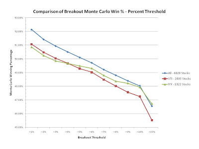
To make sure the percent profitable statistics were reasonable, I also compared the winning percentage for the Monte Carlo Statistics.  The win percentage includes the 0%-return trades while the percent profitable only accounts for the winning trades.  Below is a chart comparing the Monte Carlo winning percentage for each group of stocks over all breakout thresholds.

Once the 0%-return trades are accounted for, the results for all three groups are more similar.  The decreasing trend is still intact, but now IYY tracks closer to the All Stocks group than VTI for the higher breakout thresholds.  For lower breakout thresholds, VTI is marginally better than IYY.

I also analyzed the results by independent breakout levels.  Below are the charts summarizing the results ofr the independent breakout levels for all three groups.


Once again I compared the average return per trade for all three groups.  Below is the chart showing the comparison over all breakout levels.

The maximum average trade occurs at the same level (6-7%) for the All Stocks and VTI group, while the maximum average trade for the IYY group is similar at the 7-8% level.  The maximum average trade is 0.20% for All Stocks, 0.22% for VTI, and 0.18% for IYY.  The IYY results underestimates the All Stocks results for levels between 2% and 6%, while the VTI results are similar.  Once again we see a large deviation of the IYY results from the All Stocks and VTI groups for large breakout levels.

I would say that the VTI group is a better proxy than the IYY group for All Stocks.  The VTI group still shows some small deviations for some of the metrics, but the trends of the group are similar in almost all cases indicating that the VTI group is still capturing the market's behavior.  In future backtest analyses I will use the VTI component stocks to evaluate results.

ANALYSIS SUMMARY:
  • VTI is a better proxy than IYY to represent all US stocks
  • The average return per trade for breakout thresholds is better for VTI
  • The average return per winning trade for breakout thresholds is better for VTI
  • The average return per losing trade for breakout thresholds is better for VTI
  • The percent profitable for breakout thresholds is better for VTI
  • The Monte Carlo winning percentage is better for IYY
  • The average return per trade for breakout levels is better for VTI
UPDATE - 3/22/10
I have noticed that the components for the VTI Vanguard Total Market Vipers changes over time.  This could cause problems when if I compare the results of analyses I perform in the future with analyses already completed because the watchlist containing the component stocks could be different.  To resolve the issue, I created a separate backtest watchlist of all the component stocks for VTI on March 22, 2010.  As of this date the VTI contains 2401 stocks compared to the previous 2405 stocks.  I will be using the separate backtesting watchlist from now on so that the component stocks will not present an unwanted variable to the analyses.